Category: Uncategorized

  • How Long Do Custom Countertop Displays Take? Lead Times and a Planning Timeline

    How Long Do Custom Countertop Displays Take? Lead Times and a Planning Timeline

    The question that decides whether a countertop display program succeeds is rarely which flute or which finish. It is a calendar question: will the units be on the counter by the day the promotion starts? Miss that date and even a beautiful display is worthless, or worse, triggers a retailer chargeback for a late delivery. This guide lays out how long custom countertop displays actually take, where the time goes, and how to work backward from your in-store date so the schedule works in your favor instead of against it.

    The short answer, and why it is a range

    For a custom corrugated countertop display, plan on roughly three to six weeks from approved artwork to delivered units. The spread is wide because a display is a manufactured object with several sequential steps, and any one of them can stretch. A simple tray reusing a known structure at the fast end of that window; a heavier, structurally engineered unit with premium graphics and a cross-country freight leg at the slow end. The single biggest variable is usually not the factory at all — it is how quickly proofs get approved and how print-ready the artwork is when it arrives. Treat three to six weeks as the planning band and pin down your own number by asking the supplier for a stage-by-stage schedule.

    Where the time actually goes

    It helps to see the job as a chain of stages rather than one lump of lead time. Structural design and CAD come first, turning your product, quantity, and counter space into a die line, which typically takes several business days. Then artwork and prepress, where your graphics are laid onto that die line and a proof goes out for sign-off — the approval loop here is where projects quietly lose a week if nobody is watching. Tooling follows: cutting the steel-rule die and making print plates, generally the longest single build step. Printing and lamination come next, and for litho-laminated units there is a hard, non-negotiable minimum of about 24 hours for the adhesive to cure before the sheets can be die-cut. Finally the units are die-cut, assembled or packed flat, and handed to freight. The timeline below shows how those stages stack up.
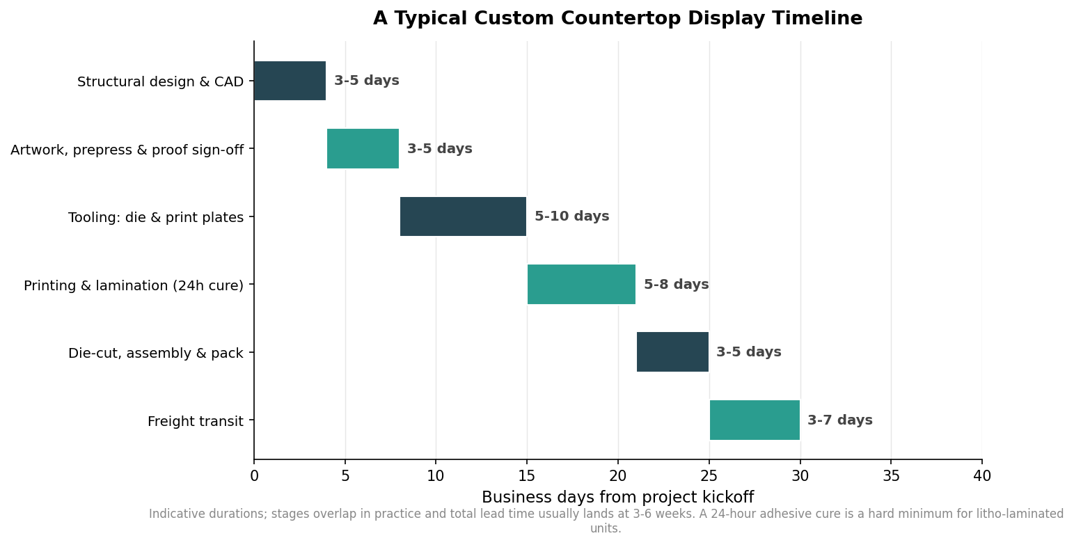
    Gantt-style timeline of custom countertop display production stages from design to freight over about 30 business days
    Indicative stage durations; steps overlap in practice and total lead time usually lands at three to six weeks.

    Two things on that chart matter most. The stages overlap in practice — prepress can start while structural details are finalized — so the real total is shorter than adding every bar end to end. And the durations are indicative: raw material availability, structural complexity, and the proof cycle can all move the finish line, which is why the honest answer is a band rather than a single date.

    The print method changes the clock

    How you print the graphics has a direct effect on both lead time and the order size that makes sense. Digital printing needs no plates, so it is the fastest to get moving and the natural pick for short runs, samples, and tests — at the cost of a higher price per unit once quantities climb. Flexo printing is efficient and quick once it is running, and its per-unit economics are strongest on high-volume programs, though it favors bold, simpler graphics over photographic detail. Litho-lamination delivers the sharpest, most photographic print but carries the highest setup and the longest lead time, so it earns its place on medium-to-high volumes where the premium look is worth the wait. The chart below maps each method to the run size where it fits best.
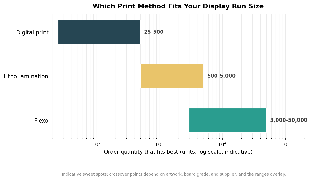
    Horizontal log-scale chart of best-fit order quantity ranges for digital, litho-lamination, and flexo printing
    The order-quantity sweet spot for each print method, which also shapes how fast the job can run.

    Read those ranges as overlapping guides, not walls. A mid-volume run of a couple thousand units can quote sensibly in more than one method, so the choice comes down to whether you are optimizing for speed, for photographic quality, or for the lowest possible unit cost at scale.

    What makes a project run late

    Almost every blown deadline traces back to the same handful of causes, and most are avoidable. Late proof approvals are the classic one — the factory cannot cut tooling against a proof nobody has signed. Artwork that is not print-ready, with low-resolution images, missing bleeds, or unconverted spot colors, sends the file back to prepress and restarts the clock. Structural revisions after the die is cut are expensive in both money and days. Trying to rush past the physical minimums, like the 24-hour adhesive cure, simply does not work no matter the rush fee. And freight is a stage in its own right: retailer delivery windows, appointment scheduling, and cross-country transit can add days that have nothing to do with how fast the display was built.

    How to plan backward from your in-store date

    The reliable way to hit a launch is to schedule in reverse. Start from the day the display must be live on the counter, subtract the freight transit time plus a safety buffer to get your ship-by date, then subtract the production, printing, tooling, and design stages to find the day you actually need to kick off. In practice that means starting the conversation six to eight weeks before an important drop rather than three, which turns the tight end of the range into breathing room. Lock your artwork and get it print-ready early, because that is the step most within your control. If this is a first run of a new structure, order a sample or prototype and build its turnaround into the plan. Above all, give the proof approval its own buffer and name who signs off, since a display that waits three days for a signature is a display that ships three days late. Plan the calendar with the same care you give the graphics, and the units will be standing on the counter the morning the promotion begins.
  • Countertop Display Sizes: Standard Footprints, PDQ Tray Dimensions, and How to Size Yours

    Countertop Display Sizes: Standard Footprints, PDQ Tray Dimensions, and How to Size Yours

    Most countertop display problems trace back to one number that gets decided last instead of first: the footprint. A counter is the most contested real estate in the store, shared with a register, a card reader, a bag well, and whatever the retailer already put there. Get the width and depth right and the display earns its spot; get them wrong and a beautiful unit gets pushed to a back shelf or refused outright. This guide covers the sizes that actually show up on counters, the retailer tray standards that constrain them, and a method for sizing a display from the product out rather than guessing.

    Start with a vocabulary check, because the format names carry size expectations. A PDQ tray (short for “pretty darn quick,” a shelf-ready tray you drop in place) is low and shallow. A counter dump bin is a deeper open box for grab-and-go product. A CDU (counter display unit) is any built-up structure, often tiered or with a header card. Each lives in a different size band, and picking the format is really picking a rough footprint before you refine it.

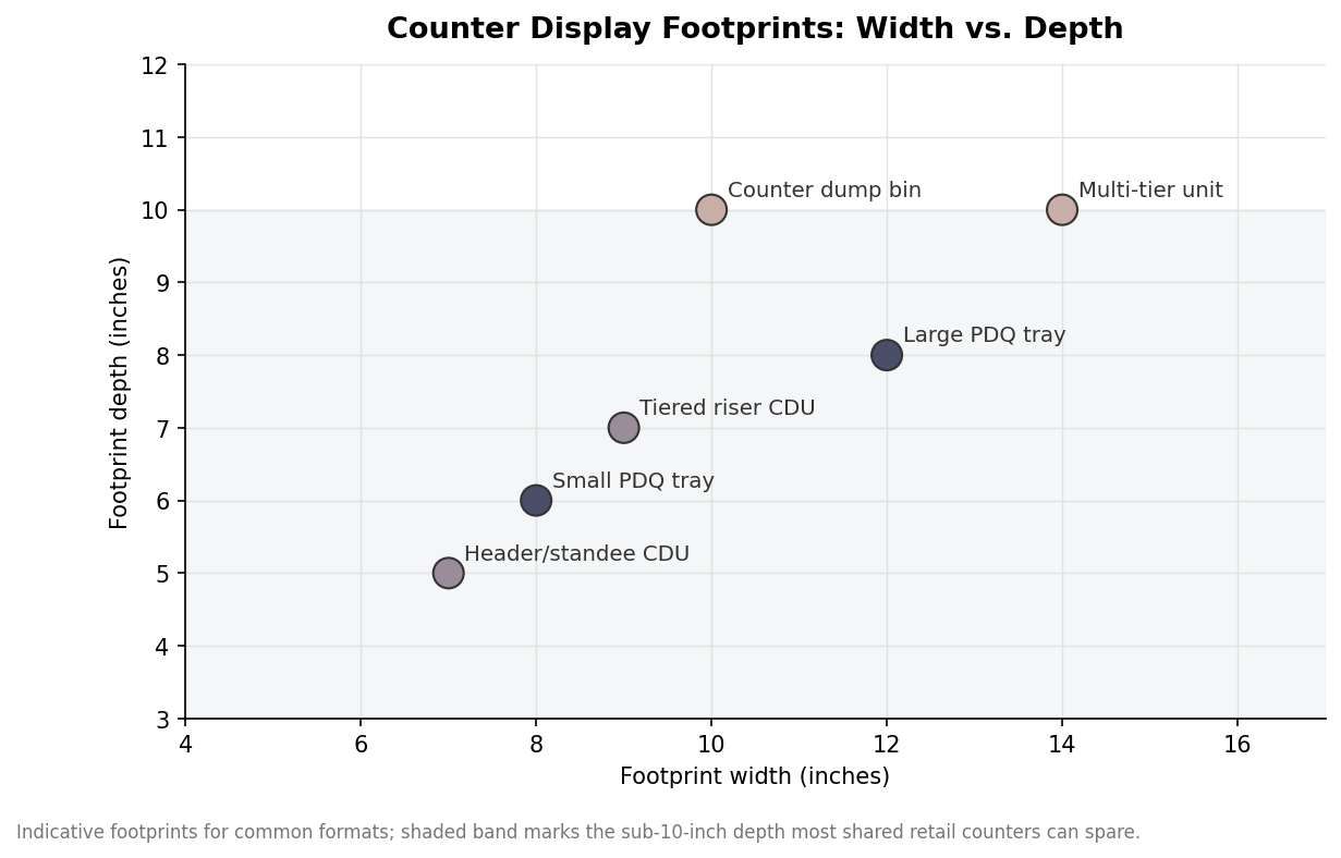
    Scatter plot of countertop display formats by footprint width and depth
    Common counter formats by footprint; depth under about 10 inches is what most shared counters can spare.

    Common counter formats and their footprints

    The workable range on a shared counter is narrower than people expect. Width has some freedom, commonly 7 to 14 inches, but depth is the scarce resource. Retail counters are often only 16 to 24 inches deep and half of that is already spoken for, so a display much deeper than 10 inches starts competing with the transaction zone and gets rejected. That is why the most accepted counter footprints cluster in the 8-to-12-inch-wide by 6-to-9-inch-deep range. Small PDQ trays sit at the shallow end for single facings of one product; tiered CDUs and multi-tier units use height rather than depth to hold more, keeping their footprint modest while stepping product up toward the shopper.

    Material quietly caps how large a counter unit can go. Corrugated is light and cheap, so a bigger footprint stays inexpensive, but a tall corrugated unit with a small base can get tippy once product is loaded high, which argues for a wider base or a lower height. Acrylic and injection pieces are heavier and more expensive per square inch, which naturally pushes their footprints smaller and their designs more compact. Metal and wood units are heavier still and usually reserved for permanent placements rather than the temporary counter spots most brands are fighting for. Choosing the material early keeps the size ambitions realistic, because the same footprint costs and behaves very differently across these substrates.

    PDQ and retailer tray standards

    If the display is going into a major retailer, you do not get to choose the size freely. Chains publish shelf-ready and PDQ specifications that fix the outer tray dimensions to their planogram module, along with rules for how deep the tray front can be cut down for visibility, how the tray must pack into a case, and sometimes a maximum height for counter placement. The practical consequence is that the tray footprint is dictated by the case and shelf module, not by your product, so you design the product arrangement to fit the tray rather than the other way around. Always pull the current spec sheet for the specific retailer and program before designing, because these standards are revised and a display built to last year’s numbers can be turned away at the door. Treat any dimension you remember as a starting point to verify, not a fact to build on.

    Sizing from the product out

    For open-market displays where you set the size, work outward from the product. Measure the primary item in width, depth, and height, then decide how many facings across and how many rows deep you want visible. Multiply through, then add clearances: roughly an eighth to a quarter inch per side so product loads and pulls without binding, plus the wall thickness of the board itself. That last point catches people out. Corrugated is not zero-thickness: single-wall B-flute eats about an eighth of an inch per wall, C-flute a bit more, and double-wall BC around a quarter inch, so a display sized to the exact product footprint ends up too tight once the real walls exist. Add a header or riser height on top if the design carries branding above the product.

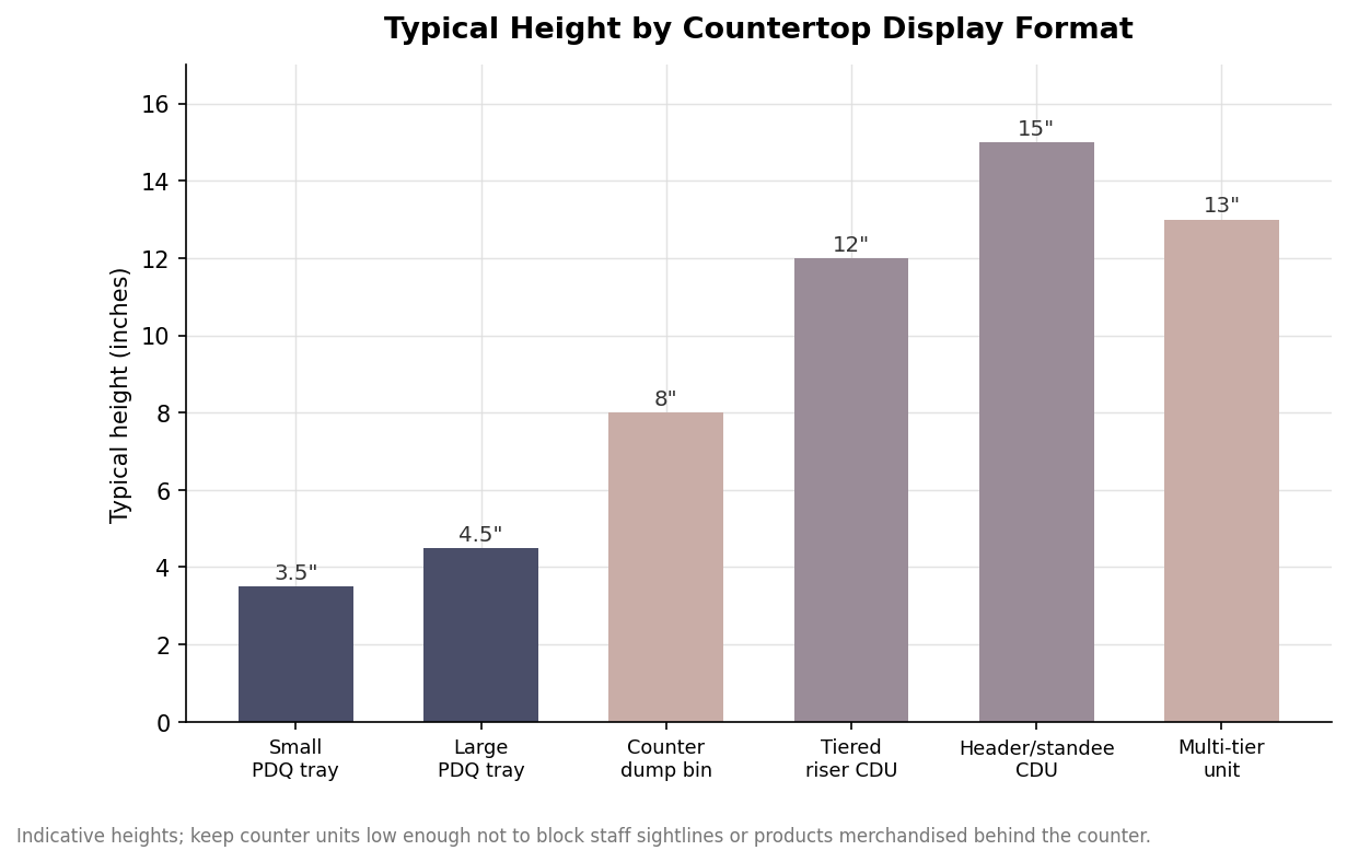
    Bar chart of typical height by countertop display format
    Typical height by format; tiered units gain capacity through height while keeping a small footprint.

    Height, sightlines, and counter reality

    Height is where counter displays go wrong in the other direction. A unit tall enough to hold more product can block a cashier’s sightline, hide products merchandised behind the counter, or simply feel imposing in a small transaction space, and staff will move it. Impulse counter units generally live between 6 and 15 inches tall, with the taller end reserved for tiered structures whose footprint stays small. If height is doing real merchandising work, confirm it against the actual counter and the staff behind it rather than an empty desk in a design studio.

    One more practical constraint ties footprint and height together: how the display ships and sets up. A unit that ships flat and folds up in a few seconds is far more likely to be deployed correctly and quickly than one that arrives assembled, fragile, and oversized. Sizing choices affect this directly, because a compact footprint and a sensible height pack more efficiently and survive transit better. Decide the footprint first, verify any retailer standard, size the structure from the product plus real clearances and board thickness, then sanity-check the height against a real counter. Do those four things in order and the display fits the space it was made for.

  • Countertop Display Types Compared: PDQ Trays, Dump Bins, Clip Strips & Risers

    Countertop Display Types Compared: PDQ Trays, Dump Bins, Clip Strips & Risers

    Most buyers start a countertop display project by arguing about material, but the format decides more than the material ever will. A tray, a dump bin, a clip strip and a tiered riser can all be printed on the same corrugated board and still perform completely differently at the register. The right format follows from three things: the shape and weight of what you are selling, how a clerk will restock it, and how much counter real estate a retailer will actually give you. Getting that match right is what separates a display that clears through and gets reordered from one that ends up flattened behind the counter.

    The tray and PDQ family: fast to stock, easy to say yes to

    Trays are the workhorse of the counter. A PDQ tray (the initials stand for “pretty darn quick”) is a shallow open box that arrives pre-filled, so a store associate drops the whole unit on the counter without touching individual items. That single quality is why buyers, category managers and store staff tend to approve them: restocking is measured in seconds, not minutes. Trays suit small, uniform, boxed or pouched products that stand or lie neatly in rows, which is why you see them holding lip balm, energy shots, trading cards and single-serve snacks. Because the walls are low and the footprint is compact, a tray asks a retailer for very little space, and a small ask is an easy ask. The trade-off is capacity and drama. A tray holds a modest facing count and does little to build height or theater, so it wins on convenience rather than on stopping power.

    Dump bins and impulse bins: volume over precision

    Dump bins trade neatness for sheer quantity. A counter dump bin is a deeper open container meant to hold loose or bagged product that customers rummage through, which makes it ideal for candy, seasonal novelties, clearance items and anything cheap enough to buy on impulse without inspection. The message a bin sends is “grab one,” and that informality is the point. Where a tray presents products in tidy rows, a bin invites hands in. The design cost is structural: a bin that carries several kilograms of loose weight needs stronger board and often a reinforced base, so it leans toward heavier flute grades than a light tray would. Bins also read as promotional rather than premium, so they fit value and seasonal plays far better than they fit a considered, higher-ticket product.

    Clip strips, sidekicks and hanging counter units

    When the counter is full, go vertical or borrow someone else’s fixture. Clip strips hang packaged product from an existing shelf edge or endcap upright, turning dead vertical space into facings without asking for any counter footprint at all. They are the cheapest way to gain placement, but they only work with hang-ready packaging that has a hang hole or header. Sidekick displays do something similar at scale, mounting to the side of a gondola so a secondary product rides alongside a primary category. For a counter specifically, a small hook or pegboard unit performs the same trick in miniature, presenting blister-packed or header-carded items upright where a flat tray would waste the vertical room. These formats reward products that are already designed to hang; they punish anything that needs to sit flat or stack.

    Tiered risers and literature holders: height and information

    Tiered units solve visibility; literature holders solve explanation. A stepped riser lifts back rows so every product is visible from a standing customer’s eye line, which matters when facings would otherwise disappear behind the front row. That extra structure costs more to engineer and ships less flat, so a riser makes sense when visibility genuinely drives the sale rather than as a default. Literature and brochure holders are a quieter cousin, built to present cards, coupons, menus or instruction sheets rather than product. They earn their place next to any item that needs a story told before purchase, from a warranty program to a loyalty sign-up, and they cost little because they carry almost no weight.

    Matching format to weight, board and budget

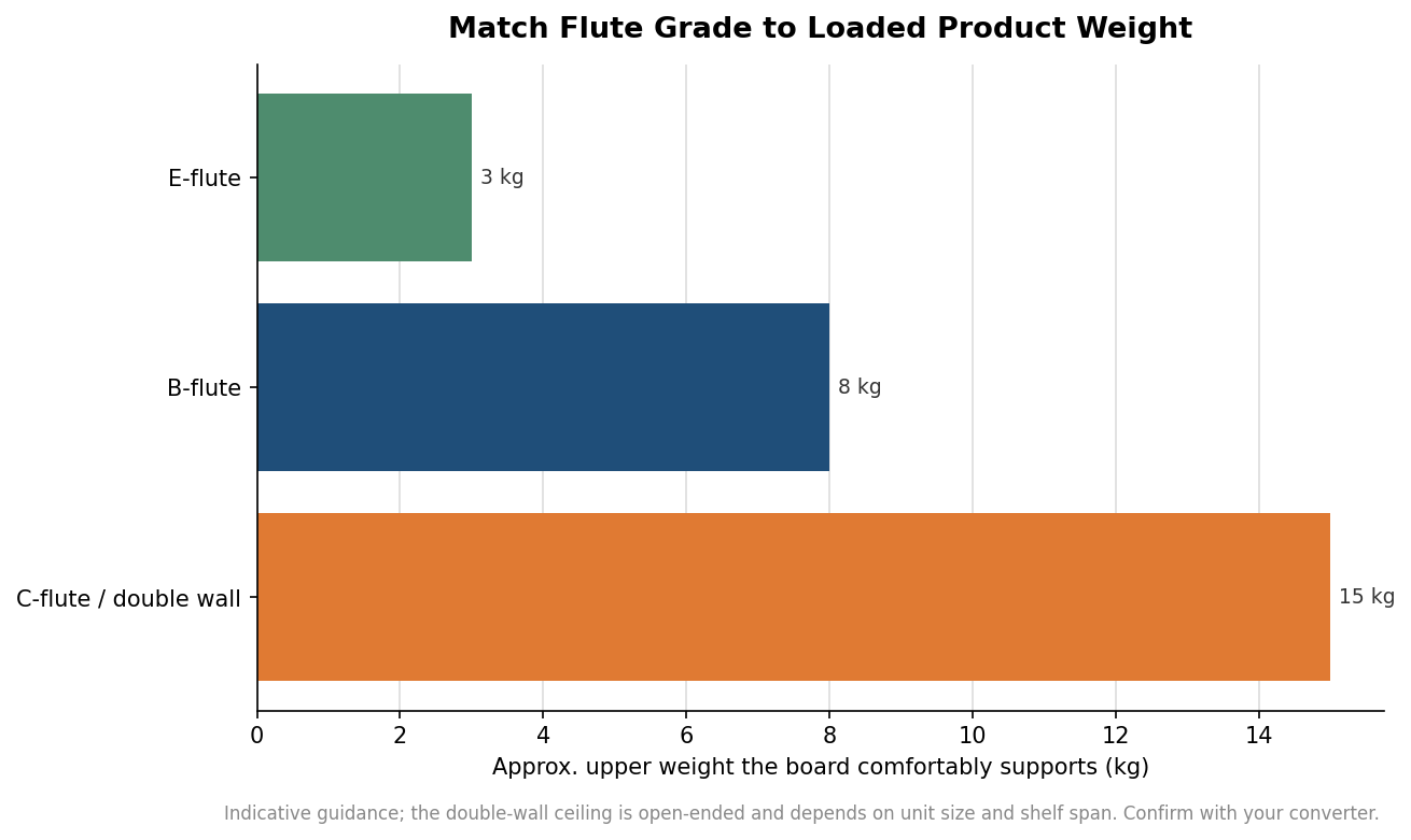
    Every format above is only as good as the board under it, and board choice follows loaded weight. As a rough guide, E-flute handles light units up to roughly three kilograms and holds fine print detail, B-flute covers the middle ground of about three to eight kilograms, and C-flute or double-wall board takes the heavy end above eight kilograms where a full tray or bin of product would otherwise sag. Treat those figures as starting points rather than limits, because a wide unsupported shelf span can overload a board well before it hits the nominal weight.

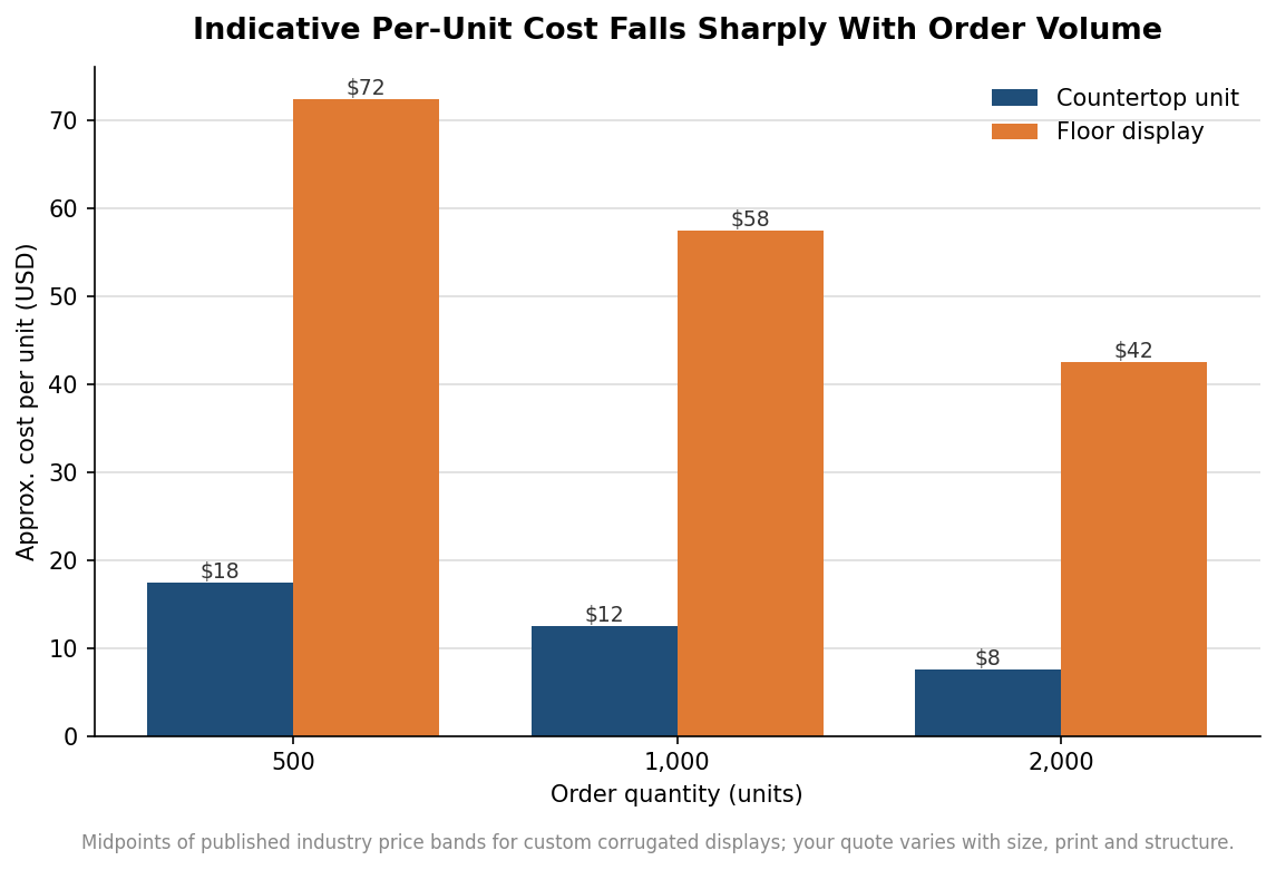
    Grouped bar chart comparing per-unit cost of countertop versus floor displays at 500, 1000 and 2000 units
    Per-unit cost drops steeply as order quantity rises, and counter units run far cheaper than floor displays.

    Budget scales with quantity far more than most first-time buyers expect, because the die-cutting tools, print plates and machine setup are fixed costs spread across the run. Published industry pricing for custom corrugated counter units tends to land around fifteen to twenty dollars each at five hundred pieces, falling to roughly ten to fifteen dollars at a thousand and into the five-to-ten-dollar range by two thousand. Floor displays sit far higher at every quantity because they carry more board, more structure and more assembly. Those bands are indicative, not a quote; your real number moves with size, the number of print colors and how complex the structure is to engineer and pack.

    Horizontal bar chart of recommended maximum product weight by corrugated flute grade
    A rough guide to matching flute grade against the loaded weight the display must carry.

    Specify the format before you specify the graphics. Decide first whether your product wants a tray’s speed, a bin’s volume, a strip’s borrowed space, a riser’s height or a holder’s messaging, then choose flute grade from the loaded weight, and only then design the print. Doing it in that order keeps you from paying for a heavy tiered unit when a flat tray would have cleared through faster, or from ordering an elegant riser for a product that a retailer will only ever give three inches of counter to hold. The format is the decision that quietly governs restocking speed, retailer approval and reorder rate, so it deserves to be made first and made deliberately.

  • Corrugated Display Strength: Flutes, ECT, and What Your Counter Unit Can Hold

    Corrugated Display Strength: Flutes, ECT, and What Your Counter Unit Can Hold

    Most conversations about a corrugated countertop display start with the artwork and the shape. The question that actually decides whether the unit survives its life on a busy counter is quieter: what is the board made of, and how much can it hold. A display that looks perfect in a rendering but sags under a dozen jars is a failure, and so is one that is overbuilt in heavy board for a few lightweight sachets. This is a plain-language explainer of the two specs that govern that outcome, flute profile and edge crush, and how to read them when you order.

    Flute profile is the board’s inner architecture

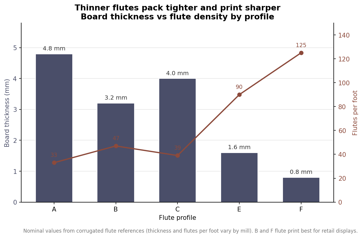
    Corrugated board is a fluted inner layer glued between flat liners, and the size of that flute changes almost everything about how the board behaves. Profiles are named by letter, and they run from thick and coarse to thin and fine. A flute is the thickest common profile at about 4.8 mm with roughly 33 flutes per foot, built for heavy or fragile shipping. C flute sits near 4.0 mm and about 39 flutes per foot as a general shipping board. B flute, around 3.2 mm and 47 flutes per foot, is a workhorse for retail displays and die-cut boxes because it combines solid crush resistance with a flat, printable face.

    The thin profiles are where fine graphics live. E flute, at roughly 1.6 mm and about 90 flutes per foot, is a lightweight retail-ready board, and F flute, near 0.8 mm and 125 flutes per foot, is the premium packaging profile that holds the sharpest print. The pattern is consistent: more flutes per foot means a thinner board with a smoother surface that accepts ink more crisply, while fewer, taller flutes trade print fidelity for cushioning and stacking strength. For a printed countertop display, B flute and F flute are the usual recommendations, with B carrying more structural load and F reserved for high-resolution, lighter-duty pieces.

    Combo chart of corrugated flute profiles A B C E F showing board thickness in mm as bars and flutes per foot as a line
    Thinner flute profiles pack more flutes per foot and print sharper; B and F flute suit printed displays.

    Edge crush is the number behind the load

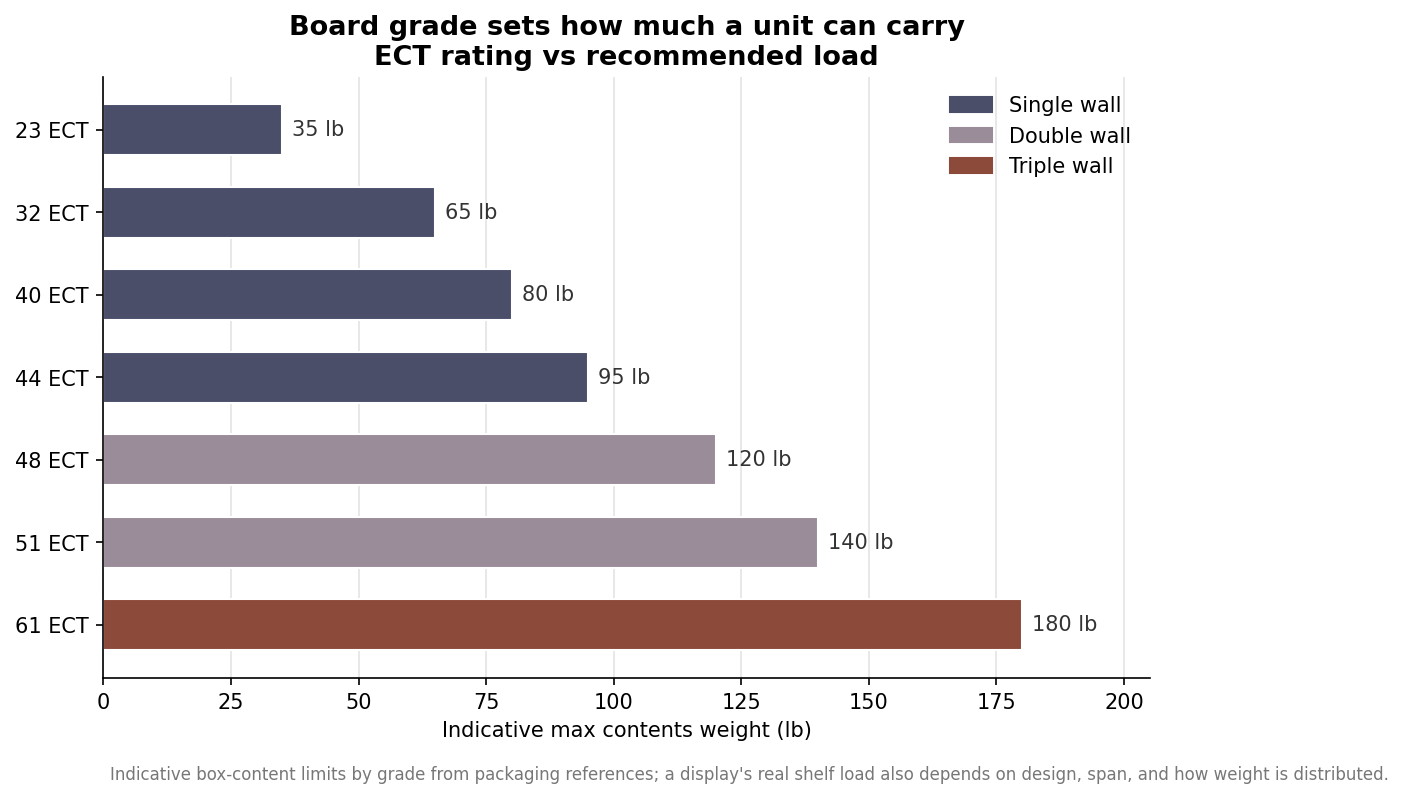
    Where flute describes the architecture, the Edge Crush Test, or ECT, measures how much force the board’s edge can bear before it buckles, reported as pounds per inch. ECT is the practical strength number, because vertical compression is what actually fails a display or a stacked box. As a rough map from packaging references, a 23 ECT single-wall board suits contents up to about 35 pounds, 32 ECT up to about 65 pounds, 40 ECT near 80 pounds, and 44 ECT up to roughly 95 pounds. Move into double wall and the numbers climb, with 48 ECT around 120 pounds and 51 ECT near 140 pounds, while triple-wall 61 ECT reaches about 180 pounds.

    Two honest caveats belong on those figures. They describe recommended contents weight for boxes under normal handling, not a guaranteed shelf rating for a specific display design, and real-world capacity drops with humidity, long storage under load, and rough transit. A display’s usable load also depends heavily on its own geometry, which the ECT number cannot capture on its own.

    Horizontal bar chart of ECT board grades from 23 to 61 ECT and their indicative maximum contents weight in pounds, colored by single, double, and triple wall
    Higher ECT grades carry more weight; single-wall grades cover most countertop displays.

    Why a display is not just a strong box

    A box gets its strength from four closed walls bearing load together. A countertop display gives some of that up on purpose, cutting away faces for visibility and access, which means the board grade alone does not tell you what a shelf will hold. Span is the hidden variable. A wide, unsupported shelf in the same board as a narrow one will bow far sooner, because the load sits farther from the supporting walls. Good display engineering puts that strength back with design rather than only with heavier board: return flanges on shelf edges, tabbed supports that transfer weight down to the base, and dividers that turn one long span into several short, stiff ones.

    This is why two displays of identical footprint can hold very different weights. A well-designed unit in 32 ECT B flute with proper shelf returns can outperform a poorly designed one in heavier board, and it does so while shipping flat and setting up faster. When you brief a supplier, describe the product’s weight and how many facings each shelf must hold, not just the board grade, so the structure can be designed around the real load.

    Reading a spec and asking the right questions

    Put the pieces together and a sensible countertop display spec reads as a short set of linked choices. Name the heaviest product the unit will hold and the number of units per shelf, so the designer can target an ECT and a shelf structure. Choose the flute for the print you need, leaning to B flute when a shelf carries real weight and to E or F flute when graphics are the priority and the load is light. State whether the piece ships assembled or flat, since flat-packed die-cut displays in B or E flute travel cheaper and set up on the counter in seconds.

    Then ask two questions that separate a reliable supplier from a hopeful one. First, ask for the board grade and flute in writing, not just a promise that it is strong, so you can compare quotes on equal terms. Second, ask for a physical sample loaded with your actual product before committing to a full run, because a display that holds its contents on a warehouse floor in dry air is the only proof that matters. Corrugated is inexpensive per unit at volume, but a display that collapses on a retailer’s counter costs far more than the board ever saved. Specifying flute and ECT deliberately, and pairing them with sound structural design, is what turns a good-looking display into one that still looks good on day ninety.

  • Hello world!

    Call or Text us: (929) 605-4397

    Welcome to WordPress. This is your first post. Edit or delete it, then start writing!

    GET A QUOTE
  • How to Order Custom Countertop Displays: A Checklist — Custom Countertop Displays

    Call or Text us: (929) 605-4397
    HomeBlog › Buyer Guides

    How to Order Custom Countertop Displays: A Checklist

    June 22, 2026 · Buyer Guides

    Ordering custom retail displays is simpler than it looks once you know what to gather. Here’s the sequence.

    1. Measure your product

    The display is built around the product, so exact dimensions and weight of the item — and how many facings you want — are the starting point.

    2. Choose material and type

    Acrylic, wood, metal, or corrugated; display, riser, rack, or holder. This follows your budget, durability needs, and brand look.

    3. Decide configuration

    Compartments, tiers, hooks, bins, or lanes — and how the product loads and restocks. Tell us the goal and we’ll engineer it.

    4. Send artwork

    Vector files for headers and printed panels are ideal; a logo is enough for us to build from. We handle the dieline and print together.

    5. Approve and produce

    We return a photo-real mockup, usually within one business day; revise free until it’s right, then production runs about two to three weeks.

    StepWhat you provide
    ProductDimensions, weight, facings
    Material & typeBudget and durability needs
    ConfigurationHow product loads and shows
    ArtworkVector files or a logo

    Start with a quote and we’ll guide you through each step.

    Key takeawayOrdering custom displays is five steps: measure the product, choose material and type, decide the configuration, send artwork, and approve a free mockup. The product’s dimensions drive the whole design.

    Ready to start? Get a custom quote for your countertop displays, learn more about how we work, or browse more guides.

    Get a quote for custom countertop displays.

    Free mockup and bulk pricing within one business day.

    Get a Quote
  • Countertop Displays for Dispensaries and Wellness Retail — Custom Countertop Displays

    Call or Text us: (929) 605-4397
    HomeBlog › Use Cases

    Countertop Displays for Dispensaries and Wellness Retail

    June 18, 2026 · Use Cases

    Dispensaries, pharmacies, and wellness retailers share a merchandising challenge: they need to look clean, professional, and trustworthy while presenting small, often regulated products securely. The right countertop displays do a lot of that work.

    Clean, wipeable materials

    Clear acrylic reads clinical-in-a-good-way — premium, hygienic, and easy to wipe down. It suits the professional atmosphere these counters need to project.

    Secure, face-out compartments

    Small products need compartments that hold them upright and visible without letting them wander. Custom acrylic wells and dividers present each SKU cleanly and keep the counter organized.

    Clear signage and information

    Sign holders and literature holders keep pricing, education, and compliance information crisp and easy to update — important where messaging changes and must be legible.

    NeedDisplay
    Professional lookClear/frosted acrylic
    Secure small SKUsCustom compartments & wells
    Clear pricing/infoSign & literature holders
    VisibilityTiered risers

    We build clean, professional counter fixtures for regulated and wellness retail. Note that any compliance or security requirements are yours to confirm — we’ll build to them.

    Key takeawayDispensary and wellness counters need clean, wipeable acrylic, secure face-out compartments for small SKUs, and crisp sign and literature holders — a professional look that presents regulated products with organization.

    Ready to start? Get a custom quote for your countertop displays, learn more about how we work, or browse more guides.

    Get a quote for custom countertop displays.

    Free mockup and bulk pricing within one business day.

    Get a Quote
  • Choosing Display Materials: Acrylic, Wood, Metal, and Corrugated — Custom Countertop Displays

    Call or Text us: (929) 605-4397
    HomeBlog › Material Guides

    Choosing Display Materials: Acrylic, Wood, Metal, and Corrugated

    June 14, 2026 · Material Guides

    Beyond acrylic vs. cardboard, countertop displays come in a wider palette of materials, each sending a different brand signal. Here’s how to match the material to your product.

    Acrylic: clean and premium

    Reads modern and high-end, lets product shine, wipes clean. Best for beauty, wellness, and premium goods.

    Wood: warm and artisan

    Signals craft, gourmet, and boutique. Natural or stained wood gives a tactile, elevated feel for specialty food, gifts, and heritage brands.

    Metal: durable and industrial

    Powder-coated steel holds weight and takes abuse. Best for food and beverage, hardware, and long-term fixtures.

    Corrugated: bold and disposable

    Full-color printed and cheap, built for promotions rolled out and recycled.

    MaterialSignalsBest for
    AcrylicPremium, cleanBeauty, wellness
    WoodArtisan, warmGourmet, gift
    MetalDurable, industrialFood/bev, hardware
    CorrugatedBold, temporaryPromotions

    The material is part of your brand message. Tell us your product and positioning and we’ll recommend the right one.

    Key takeawayAcrylic reads premium, wood reads artisan, metal reads durable, and corrugated reads bold-but-temporary. The display material is part of your brand message — match it to your product and positioning.

    Ready to start? Get a custom quote for your countertop displays, learn more about how we work, or browse more guides.

    Get a quote for custom countertop displays.

    Free mockup and bulk pricing within one business day.

    Get a Quote
  • Designing a CDU That Ships Flat and Sets Up Fast — Custom Countertop Displays

    Call or Text us: (929) 605-4397
    HomeBlog › Design

    Designing a CDU That Ships Flat and Sets Up Fast

    June 10, 2026 · Design

    When a counter display ships to hundreds of stores, the person assembling it isn’t a designer — it’s a busy staffer with thirty seconds and no tape. A great CDU (counter display unit) is engineered so setup is foolproof. Here’s what that takes.

    Auto-lock and pop-up bases

    The base should lock into shape by folding, with no glue or tape required in-store. Auto-lock bottoms and pop-up structures let a flat-packed unit become a rigid display in one motion.

    Design the dieline and graphics together

    Print and structure must be designed as one. If the dieline and artwork are developed separately, panels misalign and the header ends up cropped. We build them together so folds land where they should.

    Ship flat, save freight

    Flat-packed corrugated stacks tightly and ships cheaply — a major cost saving at scale versus pre-assembled units. It also stores flat until stores are ready to set up.

    FeatureBenefit
    Auto-lock baseNo tools or tape in-store
    Combined dieline + artPerfect print alignment
    Flat packCheap freight, easy storage
    Clear setup guideConsistent builds everywhere

    Include a simple printed setup guide and your display looks identical in every location. We handle the structural engineering and the print in one file.

    Key takeawayA great counter display unit ships flat and assembles with no tools via auto-lock bases, with the dieline and artwork designed together so every store’s build looks identical.

    Ready to start? Get a custom quote for your countertop displays, learn more about how we work, or browse more guides.

    Get a quote for custom countertop displays.

    Free mockup and bulk pricing within one business day.

    Get a Quote
  • How Countertop Displays Drive Impulse Sales — Custom Countertop Displays

    Call or Text us: (929) 605-4397
    HomeBlog › Retail Strategy

    How Countertop Displays Drive Impulse Sales

    June 6, 2026 · Retail Strategy

    The checkout counter is the single most valuable few square feet in any store. Every customer passes it, most wait there, and decisions made there are fast and emotional. A well-designed countertop display converts that attention into sales. Here’s how.

    The counter captures a captive audience

    Shoppers at the register are done choosing and open to a small add-on. A display that puts an affordable, appealing product right at hand catches the impulse before they leave.

    Visibility beats everything

    A product that isn’t seen isn’t bought. Tiered risers, face-out compartments, and a clear header that reads from a few feet away all raise the odds your product registers in the seconds a customer has.

    Design for the split-second decision

    Impulse copy is short: one benefit, one price cue, one clear brand. Cluttered displays get ignored. The best counter units feel effortless — grab, glance, buy.

    PrincipleWhy it works
    Eye-level facingSeen without effort
    Short header copyRead in a glance
    Easy to grabRemoves friction
    Restock-friendlyStays full and shoppable

    Get these right and a small display outperforms far larger placements elsewhere in the store. We design counter units around exactly these principles.

    Key takeawayThe checkout counter is a store’s most valuable space. Displays win by maximizing visibility, keeping copy short, making the product easy to grab, and staying full — designed for a shopper’s split-second decision.

    Ready to start? Get a custom quote for your countertop displays, learn more about how we work, or browse more guides.

    Get a quote for custom countertop displays.

    Free mockup and bulk pricing within one business day.

    Get a Quote